9 Advanced Data Visualizations
We know how to create static, fairly simple graphics with {ggplot2} but there is a lot more that could, and often should, be done. For example, you can easily create a simple scatter-plot but what if you wanted to change the theme, the limits of the y-axis and/or x-axis, or rotate axis-tick marks/labels, change the color scheme, add a caption? In this chapter we start with a closer look at some common tweaks used with {ggplot2} before moving on to interactive graphics. You have encountered some of these elements before but this is a more systematic walk-through.
9.1 Customizing {ggplot2} Graphics
Let us start with the easy stuff – labeling the x-axis and the y-axis, adding a chart title and a sub-title. The data-set being used is the Texas housing data (txhousing) that is bundled with the {ggplot2} package, and has 8602 observations and 9 variables:
| Variable | Description |
|---|---|
| city | Name of MLS area |
| year | Year of sale |
| month | Month of sale |
| sales | Number of sales |
| volume | Total value of sales |
| median | Median sale price |
| listings | Total active listings |
| inventory | “Months inventory”: amount of time it would take to sell all current listings at current pace of sales |
| date | No documentation available |
I want to look at the inventory and median price.
library(ggplot2)
data(txhousing)
ggplot(
  txhousing,
  aes(
    x = inventory,
    y = median
    )
  ) +
  geom_point()
Figure 9.1: Base Plot
By default, {ggplot2} will use the variable names when creating axis labels and legends, but that is not very helpful since variable names are often cryptic. Nor does {ggplot2} add a title, subtitle, or caption by default. The default grey canvas is not bad but may not be what you prefer. In addition, what if you want axis text to show a ‘%’ symbol because percentages are being plotted on that axis, or a thousands separator ‘,000’ and so on? What if the default colors being used are not to your liking? What if you want to add some text annotation to the plot? All of these issues can be easily fixed as shown below.
ggplot(
  txhousing,
  aes(
    x = inventory,
    y = median
    )
  ) +
  geom_point() +
  labs(
    title = "Median sale price vs. Inventory",
    subtitle = "2000 - 2015",
    caption = "Source: {txhousing} data from {ggplot2}",
    x = "Inventory: Months it would take to sell all current listings at current pace of sales",
    y = "Median sale price"
) 
Figure 9.2: Adding labels and a title
Notice how the data are densely clustered and so it may be feasible to make the black dots slightly transparent, perhaps even replacing the default black color used for the points.
ggplot(
  txhousing,
  aes(
    x = inventory,
    y = median
    )
  ) +
  geom_point(
    alpha = 0.15,
    color = "steelblue"
  ) +
  labs(
    title = "Median sale price vs. Inventory",
    subtitle = "2000 - 2015",
    caption = "Source: {txhousing} data from {ggplot2}",
    x = "Inventory: Months it would take to sell all current listings at current pace of sales",
    y = "Median sale price"
) 
Figure 9.3: Adding transparency and color
Of course, these data span several years so if we wanted to break this out by year we could create small multiples via facet_wrap()
What if we would like the y-axis values to show the thousands separator and maybe even with the ‘$’?9 You can do this with the scales package.
ggplot(
  txhousing,
  aes(
    x = inventory,
    y = median
    )
  ) +
  geom_point(
    alpha = 0.15,
    color = "steelblue"
  ) +
  labs(
    title = "Median sale price vs. Inventory",
    subtitle = "2000 - 2015",
    caption = "Source: {txhousing} data from {ggplot2}",
    x = "Inventory: Months it would take to sell all current listings at current pace of sales",
    y = "Median sale price"
    ) +
  scale_y_continuous(
    labels = scales::label_comma(prefix = "$")
    )
Figure 9.4: Controlling y-axis labeling
What if we wanted to add more tick-marks to both the y- and the x-axis? Say we want the y-axis to display tick-marks and accompanying labels at 25,000 intervals? And custom tick-marks for the x-axis as well?
ggplot(
  txhousing,
  aes(
    x = inventory,
    y = median
    )
  ) +
  geom_point(
    alpha = 0.15,
    color = "steelblue"
  ) +
  labs(
    title = "Median sale price vs. Inventory",
    subtitle = "2000 - 2015",
    caption = "Source: {txhousing} data from {ggplot2}",
    x = "Inventory: Months it would take to sell all current listings at current pace of sales",
    y = "Median sale price (in US$)"
    ) +
  scale_y_continuous(
    labels = scales::label_comma(prefix = "$"),
    breaks = seq(0, 325000, by = 25000)
    ) +
  scale_x_continuous(
    breaks = seq(0, 60, by = 10)
    )
Figure 9.5: Controlling axis scaling
Note how {ggplot2} nevertheless starts the y-axis at 50,000 since this is the minimum median sale price in the data-frame. The fact that the y-axis is not starting at 0 is not a deal-breaker here since you can’t have a median sale price of 0. And of course you have some liberty to craft the axis the way you want to provided you are not biasing the message a reader might walk away with. If that possibility exists then it would be prudent to alert the audience to the fact that the y-axis does not start at 0. Some dogmatic folks insist in the y-axis always starting at 0 but we have no stomach for dogma, do we?
9.1.1 Changing the theme
Changing the default plotting canvas from the dull gray would be helpful since there are several themes out there, a large number in the ggthemes package and yet others curated by several R masters. If you want to see a maestro at work, check out Bob Rudis’ hrbrthemes package.10. You could also create your own custom theme. How so, you ask? There are plenty of good sources, Thomas Mock’s post, for example and then looking at the details of the various options available in ggplot2.
ggplot(
  txhousing,
  aes(
    x = inventory,
    y = median
    )
  ) +
  geom_point(
    alpha = 0.15,
    color = "steelblue"
  ) +
  labs(
    title = "Median sale price vs. Inventory",
    subtitle = "2000 - 2015",
    caption = "Source: {txhousing} data from {ggplot2}",
    x = "Inventory: Months it would take to sell all current listings at current pace of sales",
    y = "Median sale price (in US$)"
    ) +
  scale_y_continuous(
    labels = scales::label_comma(prefix = "$"),
    breaks = seq(0, 325000, by = 25000)
    ) +
  scale_x_continuous(
    breaks = seq(0, 60, by = 10)
    ) +
  ggthemes::theme_clean()
Figure 9.6: theme_clean()
ggplot(
  txhousing,
  aes(
    x = inventory,
    y = median
    )
  ) +
  geom_point(
    alpha = 0.15,
    color = "steelblue"
  ) +
  labs(
    title = "Median sale price vs. Inventory",
    subtitle = "2000 - 2015",
    caption = "Source: {txhousing} data from {ggplot2}",
    x = "Inventory: Months it would take to sell all current listings at current pace of sales",
    y = "Median sale price (in US$)"
    ) +
  scale_y_continuous(
    labels = scales::label_comma(prefix = "$"),
    breaks = seq(0, 325000, by = 25000)
    ) +
  scale_x_continuous(
    breaks = seq(0, 60, by = 10)
    ) +
  ggthemes::theme_fivethirtyeight()
Figure 9.7: theme_fivethirtyeight()
If you haven’t run into Stephen Few’s work, take a look here.
ggplot(
  txhousing,
  aes(
    x = inventory,
    y = median
    )
  ) +
  geom_point(
    alpha = 0.15,
    color = "steelblue"
  ) +
  labs(
    title = "Median sale price vs. Inventory",
    subtitle = "2000 - 2015",
    caption = "Source: {txhousing} data from {ggplot2}",
    x = "Inventory: Months it would take to sell all current listings at current pace of sales",
    y = "Median sale price (in US$)"
    ) +
  scale_y_continuous(
    labels = scales::label_comma(prefix = "$"),
    breaks = seq(0, 325000, by = 25000)
    ) +
  scale_x_continuous(
    breaks = seq(0, 60, by = 10)
    ) +
  ggthemes::theme_few()
Figure 9.8: theme_few()
And then of course the minimalist of them all …
ggplot(
  txhousing,
  aes(
    x = inventory,
    y = median
    )
  ) +
  geom_point(
    alpha = 0.15,
    color = "steelblue"
  ) +
  labs(
    title = "Median sale price vs. Inventory",
    subtitle = "2000 - 2015",
    caption = "Source: {txhousing} data from {ggplot2}",
    x = "Inventory: Months it would take to sell all current listings at current pace of sales",
    y = "Median sale price (in US$)"
    ) +
  scale_y_continuous(
    labels = scales::label_comma(prefix = "$"),
    breaks = seq(0, 325000, by = 25000)
    ) +
  scale_x_continuous(
    breaks = seq(0, 60, by = 10)
    ) +
  theme_minimal()
Figure 9.9: theme_minimal()
And here is one of my favorite dark themes from {hrbrthemes}:
ggplot(
  txhousing,
  aes(
    x = inventory,
    y = median
    )
  ) +
  geom_point(
    alpha = 0.15,
    color = "steelblue"
  ) +
  labs(
    title = "Median sale price vs. Inventory",
    subtitle = "2000 - 2015",
    caption = "Source: {txhousing} data from {ggplot2}",
    x = "Inventory: Months it would take to sell all current listings at current pace of sales",
    y = "Median sale price (in US$)"
    ) +
  scale_y_continuous(
    labels = scales::label_comma(prefix = "$"),
    breaks = seq(0, 325000, by = 25000)
    ) +
  scale_x_continuous(
    breaks = seq(0, 60, by = 10)
    ) +
  hrbrthemes::theme_ft_rc()
Figure 9.10: theme_ipsum_rc()
9.1.2 Color Palettes
When using colors to accentuate patterns, whether in terms of the values of a variable being plotted or to differentiate between groups whose values are being plotted, we have several options. A good start would be the viridis package. To quote the authors,
These color scales are designed to be:
* Colorful, spanning as wide a palette as possible so as to make differences easy to see, * Perceptually uniform, meaning that values close to each other have similar-appearing colors and values far away from each other have more different-appearing colors, consistently across the range of values, * Robust to colorblindness, so that the above properties hold true for people with common forms of colorblindness, as well as in grey scale printing, and * Pretty, oh so pretty
You should read up on visualizations and colorblind audiences here. In a room of 8 men and 8 women at least one individual is likely to suffer from some form of color-blindness and so if you are using a variety of colors and talking about “as is visible in the chart”, chances are they are seeing something other than what you are displaying. So a safe bet is to opt for a color scheme that circumvents this handicap. The {viridis} scales come in handy here, as shown below. The basic plot is the same but I am now using a color scheme that differentiates between low and high median sale prices.
ggplot(
  txhousing,
  aes(
    x = inventory,
    y = median,
    color = volume
    )
  ) +
  geom_point() +
  labs(
    title = "Median sale price vs. Inventory",
    subtitle = "2000 - 2015",
    caption = "Source: {txhousing} data from {ggplot2}",
    x = "Inventory: Months it would take to sell all current listings at current pace of sales",
    y = "Median sale price (in US$)",
    color = "Total Value of Sales"
    ) +
  scale_y_continuous(
    labels = scales::label_comma(prefix = "$"),
    breaks = seq(0, 325000, by = 25000)
    ) +
  scale_x_continuous(
    breaks = seq(0, 60, by = 10)
    ) +
  hrbrthemes::theme_ft_rc() +
  viridis::scale_color_viridis(
    option = "magma"
) 
Figure 9.11: A viridis color schemes
Okay, now for some fun with the wesanderson package. I’ll show you just a few examples, all with color schemes that run through some of my favorite Wes Anderson movies.
library(wesanderson)
library(palmerpenguins)
ggplot(
  penguins,
  aes(
    x = bill_length_mm,
    y = bill_depth_mm,
    color = species
    )
  ) +
  geom_point() +
  scale_color_manual(
    values = wes_palette("GrandBudapest1")
    ) +
  labs(
    x = "Bill Length (in mm)",
    y = "Bill Depth (in mm)",
    color = "Species",
    title = "GrandBudapest1 palette"
    )
Figure 9.12: A few {wesanderson color palettes
ggplot(
  penguins,
  aes(
    x = bill_length_mm,
    y = bill_depth_mm,
    color = species
    )
  ) +
  geom_point() +
  scale_color_manual(
    values = wes_palette("Darjeeling1")
    ) +
  labs(
    x = "Bill Length (in mm)",
    y = "Bill Depth (in mm)",
    color = "Species",
    title = "Darjeeling1 palette"
    )
Figure 9.13: A few {wesanderson color palettes
The last few years have seen a rise in the number of color palettes available and Emil Hvitfeldt continue to do us all a tremendous service by amassing them all in the paletteer package.
#devtools::install_github("EmilHvitfeldt/paletteer")
library(paletteer)
ggplot(
  penguins,
  aes(
    x = bill_length_mm,
    y = bill_depth_mm,
    color = species
    )
  ) +
  geom_point() +
  scale_color_paletteer_d(
    'lisa::RoyLichtenstein'
    ) +
  labs(
    x = "Bill Length (in mm)",
    y = "Bill Depth (in mm)",
    color = "Species",
    title = "Roy Lichtenstein palette from {lisa}"
    ) +
  theme_minimal()
9.1.3 Adding other layers
We may want, at times, to add other layers or geometries to the main plot. For example, and this is a classic case, we have a scatter-plot of two variables and then also want to show a box-plot of each variable alongside each variable’s axis. Good idea, by all means, and this is how we might achieve that end.
library(ggExtra)
ggplot(
  penguins,
  aes(
    x = bill_length_mm,
    y = bill_depth_mm,
    color = species
    )
  ) +
  geom_point() +
  labs(
    x = "Bill Length (in mm)",
    y = "Bill Depth (in mm)",
    title = "Adding Boxplots or Histograms"
    ) +
  theme_minimal() -> myplot
ggMarginal(
  myplot,
  type = "boxplot"
  )
ggMarginal(
  myplot,
  type = "histogram"
  )
Figure 9.14: Adding some geometries
9.2 Highlighting and Marking Specific Elements
There are two packages that come in handy to emphasize certain aspects of a chart – gghighlight and ggforce
For example, say I only want to highlight some data for Cuyahoga county. Maybe the data we want are the cumulative number of COVID-19 cases per county. Let us grab the data and then build a simple line plot but then highlight the line for Cuyahoga.
# devtools::install_github("yutannihilation/gghighlight")
library(tidyverse)
readr::read_csv(
  "https://raw.githubusercontent.com/nytimes/covid-19-data/master/us-counties.csv"
  ) %>%
  filter(state == "Ohio") %>%
  rename(Date = date, County = county) %>%
  mutate(day = lubridate::day(Date)) %>%
  mutate(
    weeknum = lubridate::week(Date),
    year = lubridate::year(Date),
    Week = as.Date(paste(year, weeknum, 2, sep = "-"), "%Y-%U-%u")
    ) -> ohc
ohc %>%
  ggplot() +
  geom_line(
    aes(
      x = Week,
      y = cases,
      group = County,
      color = County
      )
    ) +
  gghighlight::gghighlight(
    County == "Cuyahoga"
    )
What if we were back with the penguins data and wanted to build a histogram of body_mass for each species but also wanted to have, as the backdrop, the histogram for all penguins (ignore differences across species)?
ggplot(
  penguins,
  aes(
    x = body_mass_g,
    fill = species
    )
  ) +
  geom_histogram() +
  facet_wrap(~ species) +
  labs(
    x = "Body Mass (in grams)",
    y = "Frequency",
    title = "Placing the overall distribution in relief",
    subtitle = "with {gghighlight}"
    ) +
  theme_minimal() +
  theme(
    legend.position = "none"
    ) +
  gghighlight::gghighlight()
What about emphasizing certain values or groups? Sure thing, not too hard to do with {ggforce}
library(ggforce)
ggplot(
  iris,
  aes(
    Petal.Length,
    Petal.Width
    )
  ) +
  geom_mark_ellipse(
    aes(
      fill = Species,
      label = Species
      )
    ) +
  geom_point() +
  theme(
    legend.position = "hide"
    )
There is a lot more functionality to {ggforce} but we do not have the space or time to do justice to them all so do look at the package’s technical documentation and various examples on the web, as seen here and here for example.
9.3 Combining multiple plots in a single canvas
When building a visualization we may, at times, want to squeeze in a few graphics into a single canvas, perhaps because of space constraints or because concatenating multiple graphics makes perfect narrative sense. There are several ways to do this bit of engineering but I will show you the three I end up using the most – (a) via cowplot, (b) via gridExtra, and, most recently, (c) via patchwork. Let us see all but {gridExtra} in action. Please bear in mind that the plots that follow are not dressed up for publication or presentation purposes since my present goal is merely to show you some functionality of the two packages.
9.3.1 {cowplot}
The {cowplot} package was built to allow for some quick customization of base ggplot2 output, resulting in what might be publication-ready figures. It will allow you to place multiple graphics in a single canvas, labeling each, aligning each, and so on.
#install.packages("cowplot")
#remotes::install_github("wilkelab/cowplot")
library(cowplot)
penguins %>%
  ggplot() +
  geom_point(
    aes(
      x = bill_length_mm,
      y = bill_depth_mm,
      group = species,
      color = species
      )
    ) +
  theme_bw() +
  theme(
    legend.position = "top"
    ) -> p1
penguins %>%
  ggplot() +
  geom_boxplot(
    aes(
      x = bill_length_mm,
      y = species,
      fill = species
      )
    ) +
  theme_bw() +
  theme(
    legend.position = "hide"
    ) -> p2
penguins %>%
  ggplot() +
  geom_bar(
    aes(
      x = species,
      group = sex,
      fill = sex
      ),
    position = "dodge"
    ) +
  facet_wrap(~ species) +
  theme_bw() -> p3
plot_grid(
  p1, p2, p3, p1,
  labels = c(
    "Plot (a)", "Plot (b)", "Plot (c)", "Plot (a) again"
    ),
  label_size = 10
) 
Figure 9.15: {cowplot in action
9.3.2 {patchwork}
The {patchwork} package is a relatively recent addition to the R-verse and works as shown below. “The goal of {patchwork} is to make it ridiculously simple to combine separate ggplots into the same graphic. As such it tries to solve the same problem as gridExtra::grid.arrange() and cowplot::plot_grid but using an API that incites exploration and iteration, and scales to arbitrarily complex layouts.”
# install.packages("devtools")
# devtools::install_github("thomasp85/patchwork")
library(patchwork)
p1 + p2 + p3
Figure 9.16: patchwork in action
The preceding code tries to squeeze each plot into a column, and that is not necessarily the best layout. For example, we may want plots p2 and p3 to be in a column of their own but p3 should be an entire row.
(p2 + p3) / p1 +
  plot_annotation(
    title = 'Here is my title: Hello {patchwork}'
    )
What if I would like each plot to have a unique tag?
((p2 + p3) / p1) +
  plot_annotation(
    tag_levels = c('A'),
    tag_prefix = 'Figure ',
    tag_sep = '.',
    tag_suffix = '',
    title = 'Here is my title: Hello {patchwork}'
    )
9.4 Labeling and Annotating Data
On occasion it will be useful to label data points because that is important for the narrative. For example, we may want to label the points in a scatter-plot with the name of the car affiliated with each point. This can be done most easily from within {ggplot2} by using geom_text() or geom_label().
ggplot(mtcars) +
  geom_point(
    aes(
      x = mpg,
      y = disp,
      group = am,
      color = am
      )
    ) +
  theme_bw() +
  theme(legend.position = "top") +
  geom_text(
    aes(
      x = mpg,
      y = disp,
      label = rownames(mtcars)
      ),
    size = 3
    )
Figure 9.17: Labeling points with geom_text()
ggplot(mtcars) +
  geom_point(
    aes(
      x = mpg,
      y = disp,
      group = am,
      color = am
      )
    ) +
  theme_bw() +
  theme(legend.position = "top") +
  geom_label(
    aes(
      x = mpg,
      y = disp,
      label = rownames(mtcars)
      ),
    size = 3
    )
Figure 9.18: Labeling points with geom_label()
The overlapping labels obscure a lot so we may want to nudge them up/down and/or left/right. An easy way to do this is via the ggrepel package’s geom_text_repel() and geom_label_repel() commands, respectively.
#install.packages("ggrepel")
#devtools::install_github("slowkow/ggrepel")
library(ggrepel)
ggplot(mtcars) +
  geom_point(
    aes(
      x = mpg,
      y = disp
      )
    ) +
  theme_minimal() +
  theme(legend.position = "top") +
  geom_text_repel(
    aes(
      x = mpg,
      y = disp,
      label = rownames(mtcars)
      ),
    size = 3
    )
Figure 9.19: Labeling points with geom_text_repel()
If you want the label, then switch to geom_label_repel(...) but keep in mind that the padding involved in the label is likely to lead to more overlaps. In my case, when I ran the code below I got a warning message: “ggrepel: 3 unlabeled data points (too many overlaps). Consider increasing max.overlaps”
By default the max.overlaps switch is set to 10, and will exclude labels for items that overlap too many things.
ggplot(mtcars) +
  geom_point(
    aes(
      x = mpg,
      y = disp
      )
    ) +
  theme_minimal() +
  theme(legend.position = "top") +
  geom_label_repel(
    aes(
      x = mpg,
      y = disp,
      label = rownames(mtcars)
      ),
    size = 3
    )
Figure 9.20: Labeling points with geom_label_repel()
Below I reran the preceding code but after setting max.overlaps = 20
ggplot(mtcars) +
  geom_point(
    aes(
      x = mpg,
      y = disp
      )
    ) +
  theme_minimal() +
  theme(legend.position = "top") +
  geom_label_repel(
    aes(
      x = mpg,
      y = disp,
      label = rownames(mtcars)
      ),
    size = 3,
    max.overlaps = 20
    )
What if we only wanted to manual transmission cars labeled and highlighted in red?
rownames(mtcars) -> mtcars$carnames
ggplot(
  mtcars,
  aes(
    x = mpg,
    y = disp,
    label = carnames
    )
  ) +
  geom_point(
    color = ifelse(mtcars$am == 1, "red", "grey45")
    ) +
  theme_minimal() +
  theme(legend.position = "top") +
  geom_label_repel(
    data = subset(mtcars, am == 1),
    aes(
      x = mpg,
      y = disp
      ),
    size = 3,
    color = "red"
    )
Note how the size = command is controlling the font-size for the labels. Note also how using geom_label-repel(…) frames the car names with a box. More details of ggrepel features are here.
Note also that we created a new variable called carnames for use, and that geom_point(…) now includes an ifelse(…) statement that colors the points red if am == 1 and grey45 otherwise. Finally, we moved the aes(…) statement out of geom_point(…) and into ggplot(…) to get everything to work as it should.
9.5 Dates and times in {ggplot2}
If one of the variables represents time, {ggplot2} has several options for managing how dates and times are used. Let us see some of these features by working with climate data for Athens, Ohio.
readr::read_csv(
  here::here(
    "data",
    "Athens1160949.csv"
    )
  ) -> athens
names(athens)
save(athens, file = here("data", "athens.RData"))
load(here("data", "athens.RData"))load("data/athens.RData")I’ll focus on the DATE and two substantive variables – the maximum daily temperature in Fahrenheit (TMAX) and the minimum daily temperature in Fahrenheit (TMIN). I will also generate a subset of the master data for ease of exposition. Unfortunately DATE is read in as a factor so I’ll convert that to a proper date field, delete rows where TMAX and TMIN are missing, and then generate annual averages of maximum and minimum temperatures.
athens %>%
  janitor::clean_names() %>%
  select(date, tmin, tmax) %>%
  mutate(
    date = lubridate::ymd(date),
    year = lubridate::year(date),
    month = lubridate::month(date, abbr = FALSE, label = TRUE),
    week = lubridate::week(date),
    dow = lubridate::wday(date, abbr = FALSE, label = TRUE)
    ) %>%
  filter(
    !is.na(tmin),
    !is.na(tmax)
    ) -> athens.df
Say we want to plot the annual minimum and maximum average temperatures.
athens.df %>%
  group_by(year) %>%
  summarize(
    avgmin = mean(tmin, na.rm = TRUE),
    avgmax = mean(tmax, na.rm = TRUE)
  ) -> athens.df.y
athens.df.y %>%
  ggplot() +
  geom_line(
    aes(x = year, y = avgmin), color = "cornflowerblue"
    ) +
  geom_line(
    aes(x = year, y = avgmax), color = "red"
    ) +
  labs(
    x = "Year",
    y = "Average Temperatures (Minimum/Maximum)"
) 
year is stored as a numeric and to lean on the date plotting functions we will have to convert year into a proper date field, with a month and a day. For convenience, I will make all dates be YYYY-01-01. I will also indicate to {ggplot2} that the x-axis should be formatted as a date with specific options.
athens.df.y %>%
  mutate(
    myyear = paste(year, "01-01", sep = ""),
    myyear = lubridate::ymd(myyear)
  ) %>%
  ggplot() +
  geom_line(
    aes(x = myyear, y = avgmin), color = "cornflowerblue"
    ) +
  geom_line(
    aes(x = myyear, y = avgmax), color = "red"
    ) +
  scale_x_date(
    date_labels = "%Y",
    date_breaks = "10 years",
    date_minor_breaks = "2 years"
    ) +
  labs(
    x = "Year",
    y = "Average Temperatures (Minimum/Maximum)"
    )
What if we had daily data? What scale_x_date(...) options could be useful then?
athens.df %>%
  filter(date < "1940-01-01") %>%
  ggplot() +
  geom_line(
    aes(x = date, y = tmax), color = "red"
  ) +
  labs(
    x = "Date",
    y = "Maximum Temperature"
  ) +
  scale_x_date(
    date_breaks = "9 months",
    date_labels = "%Y/%b"
  )
Notice that here I asked the year (%Y) and abbreviated month (%b) to be displayed at 9-month intervals. If you ask for shorter time intervals the labs will start clashing.
What if we wanted to flag the quarters instead?
athens.df %>%
  filter(date > "1932-01-01" & date < "1935-01-01") %>%
  ggplot() +
  geom_line(
    aes(x = date, y = tmax), color = "red"
  ) +
  labs(
    x = "Date",
    y = "Maximum Temperature"
  ) +
  scale_x_date(
    date_breaks = "3 months",
    labels = function(x) paste(
      quarters(x), format(x, '%Y')
      )
    )
There you have it! There is a generic scale_date(...) option and a scale_y_date(...) option as well.
9.6 {plotly}
The {plotly} package in R is Carson Sievert’s brilliant work on bringing the wonders of plotly.js – “… a high-level, declarative charting library. plotly.js ships with 20 chart types, including 3D charts, statistical graphs, and SVG maps” – to the R universe.
We’ll see a few simple examples here but you should work through Carson’s plotly for R masterclass for more advanced instruction. There are two ways to use it, either via the plot_ly() function or then porting a {ggplot2} graphic to plotly via {ggplotly}. Let us start with the same txhousing data used earlier.
#install.packages("plotly")
#remotes::install_github("plotly/plotly")
library(plotly)
data(txhousing)
txhousing %>%
  filter(
    city %in% c(
      "Arlington", "Austin", "Corpus Christi", "Dallas",
      "El Paso", "Fort Worth", "Galveston", "Houston",
      "San Antonio", "San Marcos", "South Padre Island"
      )
    ) -> tx.df
Say I want to see the Median housing sale price by city and year.
c(
  '#a6cee3','#1f78b4','#b2df8a','#33a02c',
  '#fb9a99','#e31a1c','#fdbf6f','#ff7f00',
  '#cab2d6','#6a3d9a','#ffff99','#b15928'
  ) -> mypal
tx.df %>%
  plot_ly(
    x = ~ date,
    y = ~ median,
    color = ~ city,
    colors = mypal
    ) %>%
  add_lines()
What if we wanted to look at the distribution of penguin species by island?
penguins %>%
  plot_ly(
    x = ~ island,
    color = ~ species
    )
Aha! Notice that plot_ly(...) tries to find what it thinks might be a suitable graphic given the data. You will see a message about no trace type specified: and what it thinks you may want to experiment with, as well as URL for more information.
What if it were a single categorical variable leading to a simple bar-chart?
penguins %>%
  plot_ly(
    x = ~ species,
    color = "midnightblue"
  )
Hmm, now what we expected. Instead, specify the color with I("thecolor") and it should work as expected.
penguins %>%
  plot_ly(
    x = ~ species,
    color = I("midnightblue")
  ) %>%
  layout(
    title = "Distribution of Penguin Species"
  )
What about bar-charts, say, for instance, of the total sales per city for the duration under review?
txhousing %>%
  group_by(city) %>%
  summarise(
    Sales = sum(sales, na.rm = TRUE)
    ) -> mydf
f1 <- list(
  family = "Arial, sans-serif",
  size = 9,
  color = "black"
)
a <- list(
  title = "",
  showticklabels = TRUE,
  tickfont = f1
)
mydf %>%
  plot_ly(
    y = ~city,
    x = ~Sales
    ) %>%
  add_bars() %>%
  layout(
    yaxis = a,
    title = "Total Number of Sales per City"
    )
Here is another one, from the diamonds data-set.
diamonds %>%
  count(
    cut, clarity
    ) %>%
  plot_ly(
    x = ~ cut,
    y = ~ n,
    color = ~ clarity
    )
There is a lot more you could do so be sure to work through the package documentation here and then at various blog posts and other sources ripe with examples.
9.7 {highcharter}
Joshua Kunst has created {highcharter}, an “R wrapper for Highcharts javascript library and its modules.” I like this package because it is easier to work with than some of the other ones out there. A handful of examples follow but if you are interested, check out other features of {highcharter} here and then trawl the web for other examples as well (such as Mine Cetinkaya-Rundel’s examples here and then Mara Averick’s five-post series).
Let us start with simple example using the mpg data-set to build a scatter-plot of engine displacement against highway mileage by vehicle class.
library(highcharter)
data(diamonds, mpg, package = "ggplot2")
hchart(
  mpg,
  type = "scatter",
  hcaes(
    x = displ,
    y = hwy,
    group = class
    )
  )
Here is a bar-chart.
diamonds %>%
  count(cut) -> tab.cut
hchart(
  tab.cut,
  type = "column",
  hcaes(
    x = cut,
    y = n
    ),
  colorByPoint = TRUE,
  name = "Cut"
  )
And now a histogram that you can zoom into!
hchart(
  diamonds$price,
  name = "Diamond Price",
  color = "#B71C1C"
  ) %>%
  hc_title(
    text = "You can zoom me by double-clicking a point in the chart"
    )
A line-chart with 95% confidence intervals?
library(forecast)
forecast(
  auto.arima(
    AirPassengers
    ),
  level = 95
  ) -> airforecast
hchart(
  airforecast
  )
A candlestick chart of stock prices?
library(quantmod)
getSymbols("GOOG", auto.assign = FALSE) -> x
getSymbols("AMZN", auto.assign = FALSE) -> y
highchart(
  type = "stock"
  ) %>%
  hc_add_series(
    x
    ) %>%
  hc_add_series(
    y,
    type = "ohlc"
    ) %>%
  hc_title(
    text = "Google and Amazon Stock Prices"
    ) %>%
  hc_add_theme(
    hc_theme_db()
    )
Here is a weather radial.
data("weather")
c("Min", "Mean", "Max") -> x
sprintf(
  "{point.%s}",
  c(
    "min_temperaturec",
    "mean_temperaturec",
    "max_temperaturec"
    )
  ) -> y
tooltip_table(x, y) -> tltip
hchart(
  weather,
  type = "columnrange",
  hcaes(
    x = date,
    low = min_temperaturec,
    high = max_temperaturec,
    color = mean_temperaturec
    )
  ) %>%
  hc_chart(
    polar = TRUE
    ) %>%
  hc_yAxis(
    max = 30,
    min = -10,
    labels =
      list(
        format = "{value} C"),
    showFirstLabel = FALSE
    ) %>%
  hc_xAxis(
    title = list(text = ""),
    gridLineWidth = 0.5,
    labels = list(format = "{value: %b}")
    ) %>%
  hc_tooltip(
    useHTML = TRUE,
    pointFormat = tltip,
    headerFormat = as.character(
      tags$small("{point.x:%d %B, %Y}")
      )
    )
Again, there is a lot more you can do with {highcharter}, especially in terms of maps (see next chapter) and custom charts. Be sure to work through the documentation.
9.8 Animations
So long as you have a few packages and a couple of applications installed on your machine, you can build some pretty neat animated graphs. If you plan to embed animated graphics in an html or pdf document, you will likely need to install gganimate, imagemagick, animation, and ffmpeg.
There are several examples on the web but the ones I love are Len Kiefer’s. Perhaps I am biased because I learned how to build animated plots from his code and Dave Robinson’s {gganimate} before Thomas Lin Pederson overhauled the code.
Let us look start with the Freddie Mac House Price Index data available here. I’ll pull the data for all Metropolitan Statistical Areas (MSAs) in Ohio, and then reshape the data frame so that we have msa and state as vectors, along with the home price index. In addition, I’ll separate the original Month variable since the values of year and month are originally combined into a single variable. In addition, I’ll calculate the mean home price index per year per MSA, for ease of plotting.
load("data/fmdf.RData")
fmdf %>%
  mutate(
    year = paste(year, "01-01", sep = "-"),
    date = lubridate::ymd(year)
  ) -> fmdf
load("data/fmcmh.RData")
fmcmh %>%
  mutate(
    year = paste(year, "01-01", sep = "-"),
    date = lubridate::ymd(year)
  ) -> fmcmh
We start to build a static plot to see how it will appear and then go about animating it, with humble thanks to len Kiefer for his example code repurposed here.
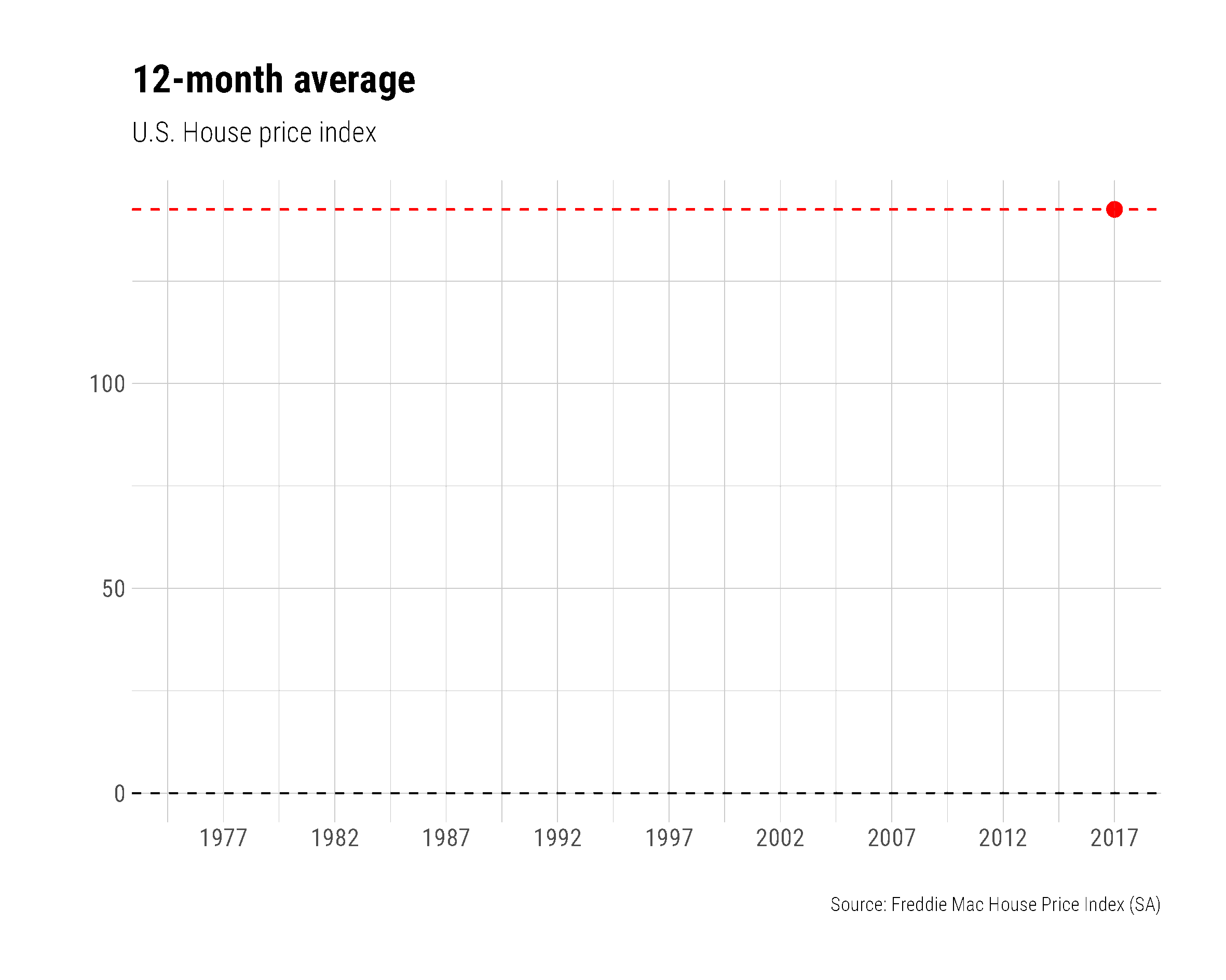
ggplot(
  data = fmcmh,
  aes(
    x = date,
    y = mean.hpi
    )
  ) +
  geom_line() +
  scale_x_date(
    date_breaks = "5 years",
    date_labels = "%Y"
  ) +
  labs(
    x = "",
    y = "",
    title = "12-month average",
    subtitle = "U.S. House price index",
    caption = "Source: Freddie Mac House Price Index (SA)"
    ) +
  theme(
    plot.title = element_text(size = 14, face = "bold"),
    plot.subtitle = element_text(size = 10,face = "italic"),
    plot.caption = element_text(hjust = 0,size = 8),
    axis.ticks.length = unit(0.25, "cm")
    ) +
  geom_point(
    data = tail(fmcmh, 1),
    color = "red",
    size = 3,
    alpha = 0.82
    ) +
  geom_hline(
    yintercept = tail(fmcmh, 1)$mean.hpi,
    color = "red",
    linetype = 2
    ) +
  geom_hline(
    yintercept = 0,
    color = "black",
    linetype = 2
    ) +
  hrbrthemes::theme_ipsum_rc()
So the static plot.hpa looks okay. Now we build the animation, starting with identifying how many unique dates we have in our data frame. We create an object, dlist to hold each unique date and then store the total number of unique dates in N; these will be used in the loop.
unique(fmcmh$date) -> dlist
length(dlist) -> N
The next step would be specifying the directory where these images should be saved before they are stitched together into a gif.
"./images/hpagifs/" -> mydir Having done that, we can start generating a series of static plots, one for each date, and each of these will be saved in the directory specified in the preceding step. Before we do that though, we have to embed the plot commands in a function.
plotf <- function(mdate = max(fmcmh$date)){
  ggplot(
  data = filter(
    fmcmh,
    date <= mdate),
  aes(
    x = date,
    y = mean.hpi
    )
  ) +
  geom_line() +
  scale_x_date(
    date_breaks = "5 years",
    date_labels = "%Y"
  ) +
  labs(
    x = "",
    y = "",
    title = "12-month average",
    subtitle = "U.S. House price index",
    caption = "Source: Freddie Mac House Price Index (SA)"
    ) +
  theme(
    plot.title = element_text(size = 14, face = "bold"),
    plot.subtitle = element_text(size = 10,face = "italic"),
    plot.caption = element_text(hjust = 0,size = 8),
    axis.ticks.length = unit(0.25, "cm")
    ) +
  geom_point(
    data = tail(fmcmh, 1),
    color = "red",
    size = 3,
    alpha = 0.82
    ) +
  geom_hline(
    yintercept = tail(fmcmh, 1)$mean.hpi,
    color = "red",
    linetype = 2
    ) +
  geom_hline(
    yintercept = 0,
    color = "black",
    linetype = 2
    ) +
  hrbrthemes::theme_ipsum_rc()
  }
Now the loop to plot each image, one per date
for (i in 1:(N + 1)) {
  file_path = paste0(mydir, "/plot", 100 + i , ".png")
  g <- plotf(dlist[min(i, length(dlist))])
  ggsave(file_path, g, width = 10, height = 8, units = "cm", scale = 2)
  print(paste(i, "out of", length(dlist)))
  }
If no errors are thrown, navigate to the directory you specified and you should see several sequentially numbered *.png files. The *.gif file, which is what you want as the final product, has to be generated by opening a terminal, navigating to the directory with the *.png files, and executing the following code in the terminal. This will work if you have ImageMagick installed on your machine.
magick convert -delay 10 loop -0 *.png cpi.gif
It will take a while but once cpi.gif is built, open it up in a browser and you should see the animated line plot.
As you can see, that was a lot of work to get a fairly simple animation working. This is why {gganimate} has become an invaluable package for animating all sorts of graphics.
9.8.1 {gganimate}
What could be better than animated ggplots? David Robinson and Thomas Lin Pedersen to the rescue. Here are two examples from the gganimate vignette. The trick is to “treat frame (as in, the time point within an animation) as another aesthetic, just like x, y, size, color, or so on. Thus, a variable in your data can be mapped to frame just as others are mapped to x or y.” In some ways this may be an easier way to build animated plots, particularly since {gganimate} is built to play nicely with {ggplot2}
#install.packages("gapminder")
#devtools::install_github("jennybc/gapminder")
#install.packages("gganimate")
#devtools::install_github('thomasp85/gganimate')
library(gapminder)
library(gganimate)
ggplot(
  gapminder,
  aes(
    x = gdpPercap,
    y = lifeExp,
    size = pop,
    colour = country
    )
  ) +
  geom_point(
    alpha = 0.7,
    show.legend = FALSE
    ) +
  scale_colour_manual(
    values = country_colors
    ) +
  scale_size(
    range = c(2, 12)
    ) +
  scale_x_log10() +
  facet_wrap(
    ~continent
    ) +
  labs(
    title = 'Year: {frame_time}',
    x = 'GDP per capita',
    y = 'life expectancy'
    ) +
  transition_time(
    year
    ) +
  ease_aes(
    'linear'
    )
But what if I wanted to rebuild the animated line-chart we build in the preceding section, albeit with {gganimate}?
ggplot(
  data = fmcmh,
  aes(
    x = date,
    y = mean.hpi
    )
  ) +
  geom_line() +
  scale_x_date(
    date_breaks = "5 years",
    date_labels = "%Y"
  ) +
  labs(
    x = "",
    y = "",
    title = "12-month average",
    subtitle = "U.S. House price index (built with {gganimate})",
    caption = "Source: Freddie Mac House Price Index (SA)"
    ) +
  theme(
    plot.title = element_text(size = 14, face = "bold"),
    plot.subtitle = element_text(size = 10,face = "italic"),
    plot.caption = element_text(hjust = 0,size = 8),
    axis.ticks.length = unit(0.25, "cm")
    ) +
  geom_point(
    data = tail(fmcmh, 1),
    color = "red",
    size = 3,
    alpha = 0.82
    ) +
  geom_hline(
    yintercept = tail(fmcmh, 1)$mean.hpi,
    color = "red",
    linetype = 2
    ) +
  geom_hline(
    yintercept = 0,
    color = "black",
    linetype = 2
    ) +
  hrbrthemes::theme_ipsum_rc() +
  transition_reveal(date)
That is it … simply adding + transition_reveal(date) did the trick.
Could I do this with more than one series? Why, yes, of course, let us look at the Google and Amazon stock price data from plotly
library(quantmod)
getSymbols("GOOG", auto.assign = FALSE) -> x
getSymbols("AMZN", auto.assign = FALSE) -> y
xts::merge.xts(x, y) -> gadf
index(gadf) -> gadates
as_tibble(gadates) -> gaddf
gadf %>%
  as_tibble(.) %>%
  bind_cols(gaddf) %>%
  rename(
    Date = value
  ) -> mydf
mydf %>%
  select(Date, AMZN.Close, GOOG.Close) %>%
  group_by(Date) %>%
  pivot_longer(
    names_to = "Stock",
    values_to = "Closing Value",
    2:3
  ) -> mygadf
mygadf %>%
  ggplot() +
  geom_line(
    aes(
      x = Date,
      y = `Closing Value`,
      group = Stock,
      color = Stock
      )
    ) +
  geom_point(
    aes(
      x = Date,
      y = `Closing Value`,
      group = Stock,
      color = Stock
      )
    ) +
  hrbrthemes::theme_ft_rc() +
  transition_reveal(Date)
Animated maps are very effective, and something we will turn to in the next chapter.