Chapter 9 Working with Multinomial Data
Very often the variables of interest will be multinomial – variables that have more than two categories. For example, you may be working with Gallup Poll data where the responses to a question asking how an individual feels about the statement “How much of the time do you think you can trust government in Washington to do what is right – just about always, most of the time, or only some of the time?” Here we have three discrete response categories. Maybe you work for Mars Inc. and have been tasked to spruce up quality control because some intrepid researcher has found the color distribution of M&Ms to be way off what the company would like it to be. Now you have a six category response – blue, orange, green, yellow, red and brown. You go to the Tennessee plant and draw a sample of M&Ms coming off the production line and count the number of candies of each color. How can you analyze your sample data to figure out if indeed the color distribution is way off? You can do it via a hypothesis test involving the Chi-square \((\chi^2)\) distribution. Let us start with a stylized example.
9.1 A Single Multinomial Variable (Goodness-of-fit test)
Say the research group I am working with is developing four public service announcements (PSAs) that warn listeners about the warning signs of a developing opioid addiction. These announcements are aired daily on major television networks during prime time. After two weeks of air time a telephone survey is used to gauge which of the four PSAs was recalled in the greatest detail by a listener. Of the 300 respondents, here is the breakdown of recall: PSA a = 85; PSA b = 95; PSA c = 50, and; PSA d = 70.
Is this what we expected to see? We had no clue going in as to which one would be more effective than another and so the best we can do is admit that we started airing the PSAs assuming each was equally effective. If they were equally effective, then recall should be evenly distributed as well, i.e., exactly one-fourth of those surveyed should have recalled PSA a, another fourth b, another fourth c, and the last fourth d. That is, we expected to see the following distribution: PSA a = 75; PSA b= 75; PSA c = 75; PSA d = 75. This situation naturally leads to specific hypotheses:
\[\begin{array}{l} H_0: \text{PSAs are equally effective, (i.e., } P_a = P_b = P_c = P_d = 25\%) \\ H_1: \text{PSAs are NOT equally effective, (i.e., } P_a \neq P_b \neq P_c \neq P_d = 25\%) \end{array}\]
Let us organize these two sets of numbers, the observed frequencies \((f_i)\) and the expected frequencies \((e_i)\), into a table.
| Observed | Expected | |
|---|---|---|
| a | 85 | 75 |
| b | 95 | 75 |
| c | 50 | 75 |
| d | 70 | 75 |
| Total | 300 | 300 |
We clearly see a drift in each row of the table, with the largest drift between observed and expected frequencies occurring for PSA c, then PSA b, then PSA a, and the least for PSA d. Certainly, some of this drift could be due to chance. How can we test whether the drift is due to chance or meaningful enough to claim a difference in the effectiveness of the four PSAs? Via a hypothesis test of course.
The test involves each cell of the table wherein we calculate the following quantity: \(\dfrac{(observed - expected)^2}{expected}\)
We then add the resulting value for each cell of the table, ending up with the \(\text{calculated } \chi^2_{df}\). This sum can be compared to the critical value from the \(\chi^2\) distribution with degrees of freedom given by \(df = \text{No. of categories } - 1\) or we can simply calculate the \(p-value\) for our \(\text{calculated } \chi^2_{df}\). If the \(p-value\) is \(\leq \alpha\), we reject the null hypothesis. The table below shows you the calculations. Note that we have four columns and hence the degrees of freedom are \(df=4-1=3\).
| Observed | Expected | Obs. - Exp. | (Obs. - Exp) Squared | (Obs. - Exp) Squared / Exp. | |
|---|---|---|---|---|---|
| a | 85 | 75 | 10 | 100 | 1.3333333 |
| b | 95 | 75 | 20 | 400 | 5.3333333 |
| c | 50 | 75 | -25 | 625 | 8.3333333 |
| d | 70 | 75 | -5 | 25 | 0.3333333 |
| Total | 300 | 300 | 0 | 1150 | 15.3333333 |
There is a unique \(\chi^2\) distribution for each degree of freedom, as shown below. The horizontal “dashed” line shows you where the \(p-value = 0.05\) lies on the \(y-axis\) while the \(x-axis\) shows you the \(\chi^2\) values. For a given degrees of freedom, we look at where the calculated \(\chi^2\) lies and if it is at or below the horizontal line, then we know the calculated \(\chi^2\) has a \(p-value \leq 0.05\).
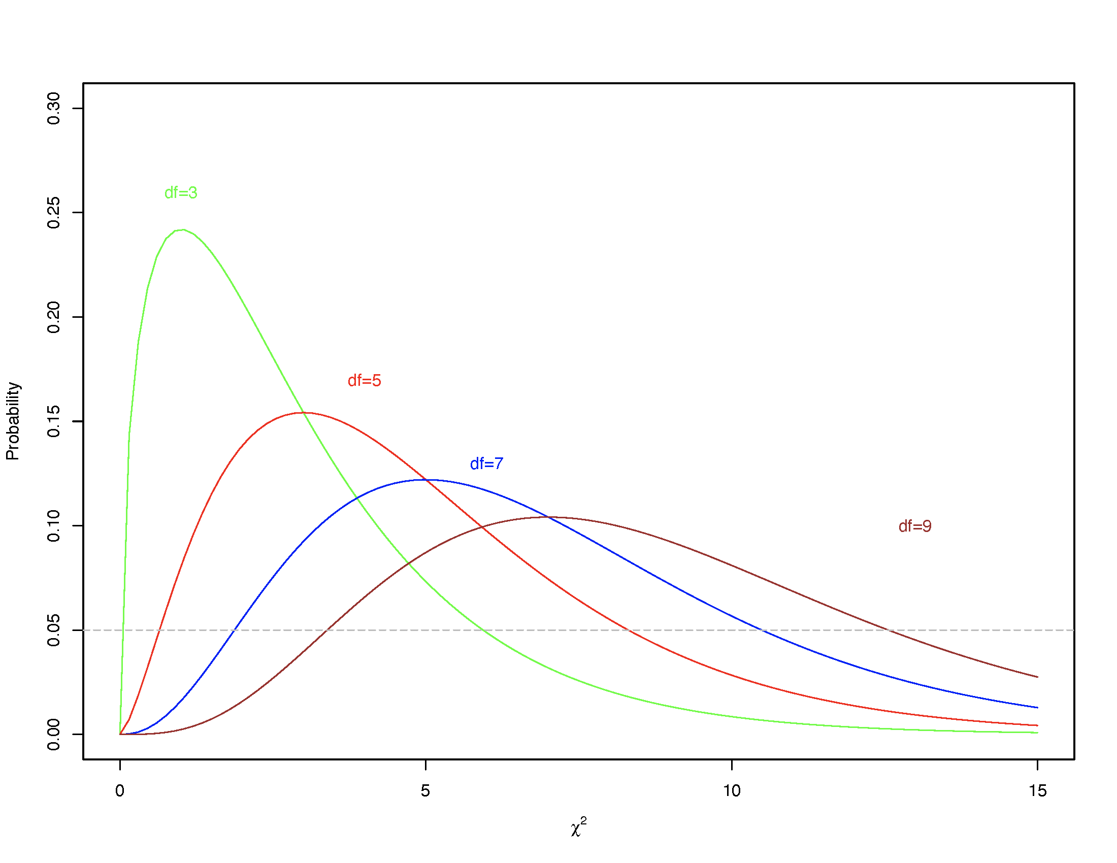
FIGURE 9.1: The Chi-Square distribution for specific degrees of freedom
In our case, the \(\chi^2_{df=3} = 15.33\) is marked by the red dot and is clearly located well below the \(p-value = 0.05\) line. In fact, the \(\chi^2_{df=3}\) has a \(p-value = 0.001555293\). Consequently, we can reject the null hypothesis; the four PSAs are not recalled with equal frequency.

FIGURE 9.2: Chi-Square = 15.33, df = 3
Note: There is an online p-value calculator. You can also conduct the test online.
9.1.0.1 Example 1
In the preceding example we had no a priori information as to what distribution to expect and hence we set each PSA’s recall to 25%. At times we may have the necessary information as, for instance, in the M&Ms example that follows. Specifically, we know that Mars Inc. claims the following distribution for M&Ms’ colors: Blue = 24%; Orange = 20%; Green = 16%; Yellow = 14%; Red = 13%, and; Brown = 13%.
Now, say you have a sample of 200 M&Ms that you randomly collect from the production line. How should you expect the six colors to be distributed if Mars Inc. has perfect quality control? Well, you should expect to see 24% Blue, which would be \(0.24 \times 200 = 48\), 20% Orange, which would be \(0.20 \times 200 = 40\), and in a similar vein, \(0.16 \times 200 = 32\) Green, \(0.14 \times 200 = 28\) Yellow, \(0.13 \times 200 = 26\) Red, and \(26\) Brown. But the observed distribution of colors turns out to be somewhat different than expected (see the table).
| Observed | Expected | |
|---|---|---|
| Blue | 42 | 48 |
| Orange | 38 | 40 |
| Green | 32 | 32 |
| Yellow | 28 | 28 |
| Red | 28 | 26 |
| Brown | 32 | 26 |
| Total | 200 | 200 |
Is the drift between the observed and the expected frequencies different enough to reject the notion that Mars Inc.’s quality control is flawless? Let us see.
\[\begin{array}{l} H_0: \text{Colors are distributed as claimed by Mars Inc.} \\ H_1: \text{Colors are NOT distributed as claimed by Mars Inc.} \end{array}\]
Let us now setup the table of calculations:
| Observed | Expected | Obs. - Exp. | (Obs. - Exp) Squared | (Obs. - Exp) Squared / Exp. | |
|---|---|---|---|---|---|
| Blue | 42 | 48 | -6 | 36 | 0.7500000 |
| Orange | 38 | 40 | -2 | 4 | 0.1000000 |
| Green | 32 | 32 | 0 | 0 | 0.0000000 |
| Yellow | 28 | 28 | 0 | 0 | 0.0000000 |
| Red | 28 | 26 | 2 | 4 | 0.1538462 |
| Brown | 32 | 26 | 6 | 36 | 1.3846154 |
| Total | 200 | 200 | 0 | 80 | 2.3884615 |
We have six categories so \(df = 6 - 1 = 5\). The calculated \(\chi^2_{df=5} = 2.388461\), and has a \(p-value = 0.7931913\). Since this is greater than \(\alpha = 0.05\) we fail to reject the null hypothesis; This sample suggests that M&M colors are likely distributed as claimed by Mars Inc. The graph shows you where the \(p-value\) falls for our calculated \(\chi^2\).

FIGURE 9.3: Chi-Square = 2.388461, df = 5
In this example, we were unable to reject the null hypothesis because the difference between the observed and the expected frequencies was too small and these small differences yielded a small \(\chi^2\) value. One simple takeaway, therefore, should be that if we see large differences before we start the test we should anticipate that the null hypothesis will not be rejected.
9.1.0.2 Example 2
During March 5-7 in 2001, Gallup asked a random sample of U.S. Adults living in the 50 states and Washington DC the following question: “Next, I’m going to read a list of problems facing the country. For each one, please tell me if you personally worry about this problem a great deal, a fair amount, only a little, or not at all? First, how much do you personally worry Race Relations?” The responses were: Great deal \(=28\%\), Fair amount \(=34\%\), Only a little \(=23\%\), and Not at all \(15\%\). When Gallup asked the question again this year (during March 1-5, 2017), the responses were as follows: Great deal \(=428\), Fair amount \(= 275\), Only a little \(= 173\), and Not at all \(=122\). Have American adults’ concerns over race relations changed since 2001?
\[\begin{array}{l} H_0: \text{ American adults' concerns over race relations have not changed since 2001} \\ H_1: \text{ American adults' concerns over race relations HAVE changed since 2001} \end{array}\]
The sample size is 998 so we first calculate expected frequencies based on the distribution of responses in 2001. The observed frequencies are given so the rest of the calculations can proceed as usual. See the table below:
| Observed | Expected | Obs. - Exp. | (Obs. - Exp) Squared | (Obs. - Exp) Squared / Exp. | |
|---|---|---|---|---|---|
| Great Deal | 428 | 279.44 | 148.56 | 22070.074 | 78.979651 |
| Fair Amount | 275 | 339.32 | -64.32 | 4137.062 | 12.192215 |
| Only a Little | 173 | 229.54 | -56.54 | 3196.772 | 13.926861 |
| Not at All | 122 | 149.70 | -27.70 | 767.290 | 5.125518 |
| Total | 998 | 998.00 | 0.00 | 30171.198 | 110.224244 |
The resulting \(\chi^2_{df=3} = 110.2242\), and has a \(p-value\) that is practically zero. We can thus reject the null hypothesis; these data suggest that American adults’ concerns over race relations HAVE changed since 2001.
9.1.1 Assumptions
The \(\chi^2\) test is also premised upon some assumptions. Namely,
- No category has expected frequencies \((e_i)\) less than \(1\)
- No more than 20% of the categories should have expected frequencies \(< 5\)
If these assumptions are violated and we nevertheless proceed with the test, the resulting conclusion will be unreliable if not completely invalid. With either assumption going unmet, we may have a working solution though, but this depends upon what the categories represent. For example, say the categories refer to a survey question where the response options were “Strongly Disagree,” “Disagree Somewhat,” “Neither Agree nor Disagree,” “Agree Somewhat,” and “Strongly Agree.” If the violation occurs for Strongly Agree or Agree Somewhat, or then for Strongly Disagree or Disagree Somewhat, we could collapse the offending categories, as shown below.
|
|
9.2 The \(\chi^2\) Test of Independence/Association
The \(\chi^2\) test can also be used to test for an association (aka a relationship) between two categorical variables. For example, Dunkin may have retained you to advise them on how to pitch different coffees to men and women. You monitor sales at a store and walk away with the following data:
| Light | Regular | Dark | Total | |
|---|---|---|---|---|
| Male | 20 | 40 | 20 | 80 |
| Female | 30 | 30 | 10 | 70 |
| Total | 50 | 70 | 30 | 150 |
Maybe you are curious to know if coffee preferences are associated with an individual’s sex. The null hypothesis would be the one you would look to reject and so you might state the hypotheses as follows:
\[\begin{array}{l} H_0: \text{Coffee preferences are not associated with sex} \\ H_1: \text{Coffee preferences ARE associated with sex} \end{array}\]
If the null hypothesis is indeed true, how many men should you have expected to say they prefer Light coffee? Given probability theory, if we think of this question as drawing an individual at random and asking ourselves what is the probability that the individual is Male (event A) and prefer Light coffee (event B)? Well, if two events A and B are independent, the probability of A and B both occurring can be calculated as \(P(A \text{ and } B) = P(A) \times P(B)\). What is the probability of drawing a Male? \(P(A) = \dfrac{80}{150} = 0.5333333\) since we have a total of 150 individuals of whom 80 are Male. What is the probability of drawing an individual who prefers Light coffee? \(P(B) = \dfrac{50}{150} = 0.3333333\). So \(P(\text{Male and Light}) = P(A) \times P(B) = \dfrac{80}{150} \times \dfrac{50}{150} = 0.1777778\). We can flip this probability into a number: How many individuals in the sample should be Male and prefer Light coffee if the two are not related? That should be \(0.1777778 \times 150 = 26.66667\). Similar calculations can be done for all the other combinations of Sex and Coffee.
In brief, for each cell in the contingency table, calculate
\[e_i = \dfrac{\text{Row}_i \text{ Total} \times \text{Column}_i \text{ Total}}{\text{Sample Size}}\]
- Male & Light: \(e_{11}=\dfrac{(80)(50)}{150}=\dfrac{4000}{150}=26.67\)
- Male & Medium: \(e_{12}=\dfrac{(80)(70)}{150}=\dfrac{5600}{150}=37.33\)
- Male & Dark: \(e_{13}=\dfrac{(80)(30)}{150}=\dfrac{2400}{150}=16.00\)
- Female & Light: \(e_{21}=\dfrac{(70)(50)}{150}=\dfrac{3500}{150}=23.33\)
- Female & Medium: \(e_{22}=\dfrac{(70)(70)}{150}=\dfrac{4900}{150}=32.67\)
- Female & Dark: \(e_{23}=\dfrac{(70)(30)}{150}=\dfrac{2100}{150}=14.00\)
Voila! We have all expected frequencies and can proceed with the test. First, we calculate, for each cell in the contingency table, \(\dfrac{(f_{ij}-e_{ij})^{2}}{e_{ij}}\). We then add the resulting value over all cells. This yields
\[ \chi^{2}_{df} = \sum_{i} \sum_{j} \dfrac{(f_{ij} - e_{ij})^{2}}{e_{ij}} \]
where \(df=(r-1)(c-1)\), with \(r=\) the number of rows in the table and \(c=\) number of columns in the table. Our example has 2 rows and 3 columns so \(df = (r-1)(c-1) = (2-1)(3-1) = (1)(2) = 2\)
| Observed | Expected | Obs. - Exp. | (Obs. - Exp) Squared | (Obs. - Exp) Squared / Exp. | |
|---|---|---|---|---|---|
| Male L | 20 | 26.67 | -6.67 | 44.4889 | 1.6681252 |
| Male R | 40 | 37.33 | 2.67 | 7.1289 | 0.1909697 |
| Male D | 20 | 16.00 | 4.00 | 16.0000 | 1.0000000 |
| Female L | 30 | 23.33 | 6.67 | 44.4889 | 1.9069396 |
| Female R | 30 | 32.67 | -2.67 | 7.1289 | 0.2182094 |
| Female D | 10 | 14.00 | -4.00 | 16.0000 | 1.1428571 |
| Total | 150 | 150.00 | 0.00 | 135.2356 | 6.1271010 |
So we have \(\chi^2_{df=2} \approx 6.13\). Looking up the p-value in the online calculator shows the \(p-value\) to be \(0.046654\).
Note that you can also conduct the test online so long as you have the observed and expected frequencies.
Note also that you cannot have more than 20% of your cells with an expected frequency \(< 5\) or any cell with expected frequencies \(< 1\). When that happens, an alternative test, Fisher's Exact Test, is recommended.
Here is another example, this time from the Open Data Policing project. The specific piece of data I want to look at are the number of traffic stops resulting in a ticket, by race, in the Greater Chicago area.
| Race | Tickets | Stops |
|---|---|---|
| White | 222 | 18206 |
| Black | 1138 | 22560 |
| Hispanic | 1141 | 12643 |
| Asian | 22 | 3102 |
| Total | 2523 | 56511 |
\[\begin{array}{l} H_0: \text{Driver's race is independent of traffic stops resulting in a ticket} \\ H_1: \text{Driver's race is NOT independent of traffic stops resulting in a ticket} \end{array}\]
Using the online calculator we find \(\chi^2_{df=3} = 1077.88\) with a \(p-value < 0.0001\) and can easily reject the null hypothesis; these data suggest that driver’s race and getting a ticket are not independent.
9.3 Fisher’s Exact Test
This test involves calculating the probability of ending up with the observed frequencies as recorded. It is computationally intensive because it involves calculating, under the assumption that \(H_0\) is true, all possible tables that would yield the same row totals and column totals. For example, if we had a \(2 \times 2\) contingency table such as the one below,
| Column 1 | Column 2 | Total | |
|---|---|---|---|
| Row 1 | 1 | 8 | 9 |
| Row 2 | 4 | 5 | 9 |
| Total | 5 | 13 | 18 |
the perturbations of cell frequencies would be as shown below, all holding the row and column totals fixed:
|
|
|
|
|
|
The probability of observing a given table would have to be calculated as \(\dfrac{(a+b)!(c+d)!(a+c)!(b+d)!}{n!a!b!c!d!}\), and once that is done, the \(p-value\) for Fisher’s exact test calculated by summing all probabilities less than or equal to the probability of the observed table. I am sure it is clear why you would only do this test via a computer, not by hand. There is an online calculator as well for \(2 \times 2\), \(2 \times 4\), and \(3 \times 3\) contingency tables.
To complete the example, note that the observed table has a probability of \(0.132\). The \(p-value\) for Fisher’s exact test is the sum of four of the other tables \(0.132 + 0.132 + 0.0147 + 0.0147 = 0.293\). This \(pvalue\) is not \(\leq 0.05\) so we would fail to reject the null hypothesis; the data suggest that the row variable and the column variable are independent.
9.4 A Cautionary Tale
One has to be careful when working with large samples because if you have enough data, finding statistical significance becomes easy. You can see this very clearly with the \(\chi^2\).
Washington state’s Public Interest Research Group (PIRG) found in its recent study that 46% of full-time college students work 25 or more hours per week. A sample of 200 included 90 who worked 1-15 hours per week, 60 who worked 16-24 hours per week, and 50 who worked 25-34 hours per week. Students were also asked if their work had a positive, negative, or no effect on their grades. Assume you have access to the data shown in the “Small Sample” table below while your neighbor has access to the data shown in the “Large Sample” table. Look at the data carefully and note that the cell frequencies differ by a constant factor, that is the only difference.
| Positive | None | Negative | Total | |
|---|---|---|---|---|
| 1-15 hours | 26 | 50 | 14 | 90 |
| 16-24 hours | 16 | 27 | 17 | 60 |
| 25-34 hours | 11 | 19 | 20 | 50 |
| Total | 53 | 96 | 51 | 200 |
| Positive | None | Negative | Total | |
|---|---|---|---|---|
| 1-15 hours | 260 | 500 | 140 | 900 |
| 16-24 hours | 160 | 270 | 170 | 600 |
| 25-34 hours | 110 | 190 | 200 | 500 |
| Total | 530 | 960 | 510 | 2000 |
Now, if you calculated the \(\chi^2\) for both sample sizes, the Small Sample would yield \(\chi^2_{df=4} = 10.59\) and with \(\alpha = 0.01\) you would be unable to reject the null hypothesis because the \(p-value = 0.03157959\).
In contrast, the large sample would yield \(\chi^2_{df=4} = 106.03\) and this would have a \(p-value = 5.109665e-22\), which is practically \(0\), easily allowing you to reject the null hypothesis of no association. How come such contrasting conclusions? Strictly because of a difference in sample size. What should we do then? For the moment, nothing, since the solutions go beyond the purview of this course. I do, however, want you to recognize the issue of large samples being preordained to more often than not yield statistically significant results. This recognition will come in handy should you ever have large samples to work with.
9.5 Chapter 9 Practice Problems
For all problems involving a hypothesis test, you must state the null and the alternative nhypotheses AND your conclusion, in words. Merely saying “we reject” or “we fail to reject” is insufficient.
Problem 1
Revisit the Titanic data-set and answer the following questions with a suitable test:
- Was survival independent of a passenger’s class of travel?
- Was survival independent of whether the passenger’s sex?
Problem 2
The Youth Risk Behavior Surveillance System (YRBSS) was developed in 1990 to monitor priority health risk behaviors that contribute markedly to the leading causes of death, disability, and social problems among youth and adults in the United States. These behaviors, often established during childhood and early adolescence, include (i) Behaviors that contribute to unintentional injuries and violence; (ii) Sexual behaviors related to unintended pregnancy and sexually transmitted infections, including HIV infection; (iii) Alcohol and other drug use; (iv) Tobacco use; (v) Unhealthy dietary behaviors; and (vi) Inadequate physical activity. In addition, the YRBSS monitors the prevalence of obesity and asthma and other priority health-related behaviors plus sexual identity and sex of sexual contacts. From 1991 through 2015, the YRBSS has collected data from more than 3.8 million high school students in 1,700+ separate surveys.
The problems that follow rely upon the YRBSS 2015 data and the documentation for the data-set can be found here. Read the documentation carefully, in particular, the details of the survey questions. Then answer the following questions:
Were males or females (Q2) more likely to ride often with a driver who had been drinking (Q10)?
Is a youth’s frequency of riding with a driver who had been drinking (Q10) independent of sex (Q2)?
Is physical dating violence (Q22) associated with sex (Q2)? Who was more likely to be subjected to physical dating violence?
Is sex (Q2) and ever considered suicide (Q27) related? Who is less likely to have considered suicide?
Problem 3
Gallup has long measured Partisanship, essentially splitting the electorate into Republicans, Independents and Democrats. In 1988, the distribution was 31% Republicans, 33% Independents, and 36% Democrats. A recent poll conducted by a different polling firm found 1,746 likely voters breaking down their party identification as 468 Republicans, 522 Democrats and 756 Independents. Has the distribution of partisanship changed since 1988?
Problem 4
Why does America vote as it does on Election Day? The mission of the American National Election Studies (ANES) is to inform explanations of election outcomes by providing data that support rich hypothesis testing, maximize methodological excellence, measure many variables, and promote comparisons across people, contexts, and time. The ANES serves this mission by providing researchers with a view of the political world through the eyes of ordinary citizens. Use these data to answer the following questions:
- Is a respondent’s perception of whether things are generally on the right/wrong track in the country (V161081) independent of whether she/he and her/his family are better/worse off than a year ago (V161110)?
- Is a respondent’s view on marijuana legalization (V162179) independent of his/her opinion on government regulation of business (V162186)?
- Were older people (V161267x) more likely to favor legalizing marijuana (V162179)?
Problem 5
The World Values Survey (WVS) is a global network of social scientists studying changing values and their impact on social and political life, led by an international team of scholars, with the WVS Association and WVSA Secretariat headquartered in Vienna, Austria. The survey, which started in 1981, seeks to use the most rigorous, high-quality research designs in each country. The WVS consists of nationally representative surveys conducted in almost 100 countries which contain almost 90 percent of the world’s population, using a common questionnaire. The WVS is the largest non-commercial, cross-national, time series investigation of human beliefs and values ever executed, currently including interviews with almost 400,000 respondents. Moreover the WVS is the only academic study covering the full range of global variations, from very poor to very rich countries, in all of the world’s major cultural zones.
One of the WVS data-sets is available here in SPSS format with the Excel version available here, and the documentation is available here. Use the 2014 data to answer the following questions: questions:
- Is religiosity (V147) associated with agreement/disagreement with the statement that “When jobs are scarce, men should have more right to a job than women” (V45)? What patterns are evident in the data?
- What about the possible relationship between an individual’s sex (V240) and V45? What patterns are evident in the data?
Problem 6
There is a common perception that hate crimes on university/college campuses tend to occur on the basis of sexual orientation (60%), then on the basis of race (30%), and the remaining hate crimes occur on the basis of religion. In 2015, the following number of hate crimes were recorded by the Federal Bureau of Investigation (FBI): Race = 108, Religion = 51, Sexual Orientation = 32. Does this suggest that the common perception should be rejected?
Problem 7
Windows kill more birds than any other human-related factor. Somewhere between 100 million and a billion birds die each year by crashing into windows on buildings in North America alone, which represents up to 5% of the total number of birds in the area. One possible mechanism to prevent this mortality is angling windows downwards slightly, which would then reflect the ground rather than an image of the sky to the flying bird. An experiment was done to look at the number of birds that died as a result of vertical windows, windows angled 20 degrees off vertical and 40 degrees off vertical (Klem Jr et al. (2004)). The angles were randomly assigned to six identical windows, and the assignments were randomly varied daily for four months. The amount of time that windows were at each of the three angles was the same. Over the course of the experiment, 30 birds were killed by windows in the vertical orientation, 15 were killed by windows set at 20 degrees off vertical, and 8 were killed by windows set at 40 degrees.
Use an appropriate test to determine if bird deaths are independent of window angles.
Problem 8
To the casual observer, any profession must have as many highly rated workers as there are poorly rated workers. Most of us assume the same should be true for education. In the recent past, New York had the following distribution of the 35,752 teachers for whom the state had calculated a teacher effectiveness rating: 7% Highly Effective; 77% Effective; 11% Developing, and 5% Ineffective.
Use an appropriate test to determine if the casual observer’s assumption of evenly distributed teacher effectiveness has any merit to it.
Problem 9
American municipal governments are organized in different ways, ranging from the
- Mayor-Council form of government – Elected council or board serves as the legislative body. The chief elected official is the head of government, with significant administrative authority, generally elected separately from the council.
- Council-Manager form of government – Elected council or board and chief elected official (e.g., mayor) are responsible for making policy with advice of the chief appointed official. A professional administrator appointed by the board or council has full responsibility for the day-to-day operations of the government.
- Commission form of government – Members of a board of elected commissioners serve as heads of specific departments and collectively sit as the legislative body of the government.
- Town Meeting form of government – Qualified voters convene to make basic policy and to choose a board of selectmen. The selectmen and elected officers carry out the policies established by the government.
- Representative Town Meeting form of government – Voters select citizens to represent them at the town meeting. All citizens may attend and participate in debate, but only representatives may vote.
Are these forms of government evenly distributed? Survey data indicate the following distribution, based on a total of 4,000 responses: Mayor-Council (33%), Council-Manager (59%), Commission (1%), Town Meeting (6%), and Representative Town Meeting (1%).
Problem 10
Hurricanes hit the US often and hard, causing some loss of life and many economic costs. They are ranked in severity by the Saffir-Simpson scale, which ranges from category 1 to category 5, with 5 being the worst. In some years, as many as 3 hurricanes that rate a category 3 or higher hit the US coastline, while in other years no hurricane of this severity hits the US. The following table gives the number of years that had 0, 1, 2, 3 or more hurricanes of at least category 3 in severity, over the 100 years of the twentieth century Blake et al. 2007:
| Number of Years | |
|---|---|
| 0 | 50 |
| 1 | 39 |
| 2 | 7 |
| 3 | 4 |
| 4 or more | 0 |
Expected frequencies are 52, 34, 11, 2, and 1. Use an appropriate test to determine whether the observed distribution of hurricanes follows the expected distribution.
Problem 11
Given that Halloween is all that and more in some parts of the country, believe it or not we have annual surveys of candy hierarchy. Download the data for 2017 and answer the following questions.
- Are opinions about Snickers (Q6 | Snickers) independent of whether the respondent is a male or female (Q2 | Gender)?
- Are opinions about Toblerone (Q6 | Tolberone) (sic!) independent of opinions about Snickers (Q6 | Snickers)?
Problem 12
This data-set provides information on a large number of loan applications. Using these data, answer the following questions:
- What is the most likely “purpose” of a loan?
- If you focus only on whether the applicant owns or rents their home, is there any relationship between owning (versus renting) a home and the purpose of the loan application?
- Create a five-group version of loan_amount. Given the resulting distribution, what is the modal loan amount group?
- Is there any relationship between the grouped loan amount variable and the purpose of the loan?
Problem 13
Why are our best and most experienced employees leaving prematurely? The data available here includes information on several current and former employees of an anonymous organization. Fields in the data-set include:
- satisfaction_level = Level of satisfaction (0-1)
- last_evaluation = Evaluation of employee performance (0-1)
- number_project = Number of projects completed while at work
- average_monthly_hours = Average monthly hours at workplace
- time_spend_company = Number of years spent in the company
- Work_accident = Whether the employee had a workplace accident
- left = Whether the employee left the workplace or not (1 or 0)
- promotion_last_5years = Whether the employee was promoted in the last five years
- sales = Department in which they work for
- salary = Relative level of salary (low med high)
Using these data, answer the following questions:
- Is whether the employee was promoted in the last five years related to a work accident?
- Is whether the employee was promoted in the last five years related to whether they stayed or left?
- Is whether an employee left or stayed related to the relative level of their salary?
Problem 14
Since 1972, the General Social Survey (GSS) has provided politicians, policymakers, and scholars with a clear and unbiased perspective on what Americans think and feel about such issues as national spending priorities, crime and punishment, intergroup relations, and confidence in institutions. Use the 2016 GSS data available here in SPSS format or the [Excel data here]((https://aniruhil.github.io/avsr/teaching/dataviz/GSS2016.xlsx) to answer the following questions:
- Is there any relationship between an individual’s sex (sex) and their view of their own spirituality (sprtprsn)?
- Is there any relationship between an individual’s sex (sex) and whether they oppose or support capital punishment (cappun)?
- What about between an individual’s highest degree (degree) and whether they oppose or support capital punishment (cappun)?
Problem 15
Using the fatal police shootings data-set, answer the questions that follow. Be sure to read the following details of the data-set.
The Washington Post is compiling a database of every fatal shooting in the United States by a police officer in the line of duty since Jan. 1, 2015.
In 2015, The Post began tracking more than a dozen details about each killing - including the race of the deceased, the circumstances of the shooting, whether the person was armed and whether the victim was experiencing a mental-health crisis - by culling local news reports, law enforcement websites and social media and by monitoring independent databases such as Killed by Police and Fatal Encounters. The Post conducted additional reporting in many cases. In 2016, The Post is gathering additional information about each fatal shooting that occurs this year and is filing open-records requests with departments. More than a dozen additional details are being collected about officers in each shooting.
The Post is documenting only those shootings in which a police officer, in the line of duty, shot and killed a civilian - the circumstances that most closely parallel the 2014 killing of Michael Brown in Ferguson, Mo., which began the protest movement culminating in Black Lives Matter and an increased focus on police accountability nationwide. The Post is not tracking deaths of people in police custody, fatal shootings by off-duty officers or non-shooting deaths.
The FBI and the Centers for Disease Control and Prevention log fatal shootings by police, but officials acknowledge that their data is incomplete. In 2015, The Post documented more than two times more fatal shootings by police than had been recorded by the FBI. Last year, the FBI announced plans to overhaul how it tracks fatal police encounters.
Most of the variables are self-explanatory but the following information may be helpful for two:
- Race = W: White, non-Hispanic; B: Black, non-Hispanic; A: Asian; N: Native American; H: Hispanic; O: Other; None: unknown
- Gender = M: Male; F: Female; None: unknown
The threat level column was used to flag incidents for the story by Amy Brittain in October 2015. http://www.washingtonpost.com/sf/investigative/2015/10/24/on-duty-under-fire/ As described in the story, the general criteria for the attack label was that there was the most direct and immediate threat to life. That would include incidents where officers or others were shot at, threatened with a gun, attacked with other weapons or physical force, etc. The attack category is meant to flag the highest level of threat. The other and undetermined categories represent all remaining cases. Other includes many incidents where officers or others faced significant threats. The threat column and the fleeing column are not necessarily related. For example, there is an incident in which the suspect is moving away from officers (fleeing) and at the same time turns to fire at gun at the officer. Also, attacks represent a status immediately before fatal shots by police; while fleeing could begin slightly earlier and involve a chase.
- Is there a relationship between the victim’s race/ethnicity and if the office was wearing a body camera or not?
- Is there a relationship between the victim’s race/ethnicity and the victim’s sex?